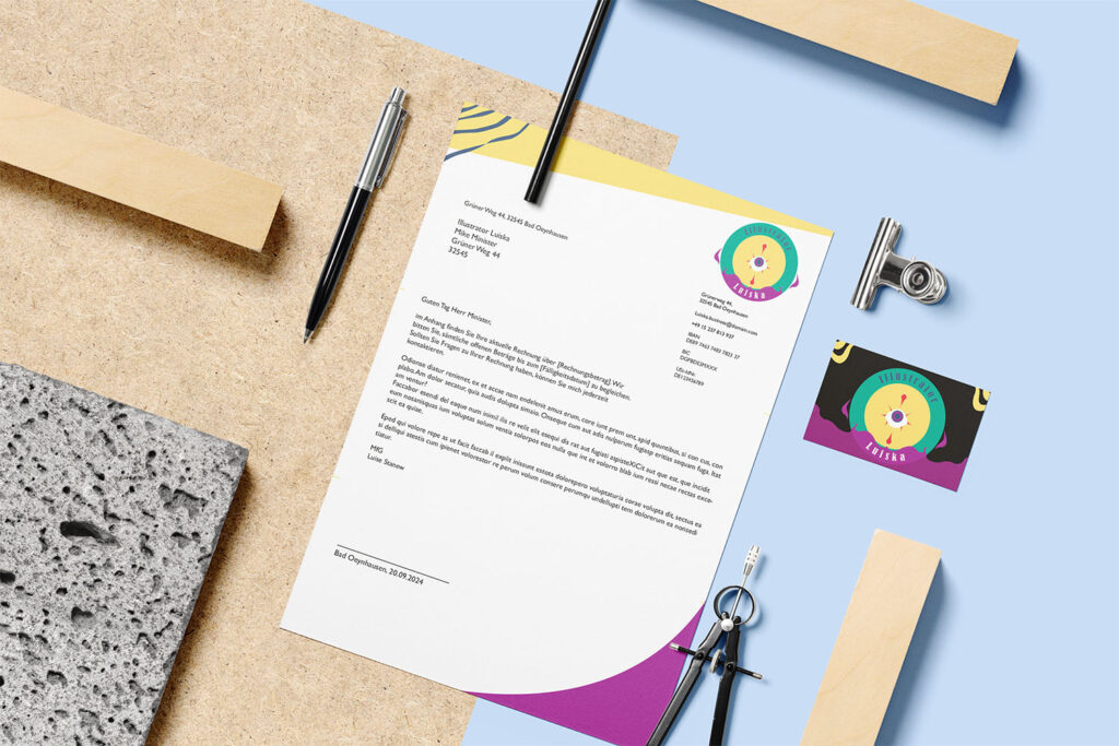
The idea was to create business
stationary as an example of my own
made-up logo and corporate design. The
first thing I had to do was to look at some
already existing logos and corporate
designs that I really liked and to think
about why I like them so much. I ended
up choosing illustrative and shape heavy
logos as they spoke the most to me.
After that I had to think about the
philosophy and messages, I wanted
to spread with the design I would end
up with. After thorough examination
I realized I wanted to use the colors
green, purple and yellow to represent
a dedication to fulfillment and balance.
These having been my color choice due
to their triadic color scheme, inspired
me to delve into the topic of illustration
even further within that logo. I wanted
this stationary to show how I would
represent myself if I were to fully go into
business as an illustrator.
I used multiple circles as the basis for
my logo, these represent the core of
illustrations, more specifically character
illustrations which are my favorite, using
circles as a basis in a sketch. The core
of the logo is an eye, one of my favorite
things to see illustrated, with multiple
lashes surrounding it, the top and
bottom lash both form into pens which is
the core element most known for some
sort of artist. Additionally, I used multiple
curves and lines to show the use of the
pens.